
Good morning!!
While I think I've mentioned to you several times my undying fealty to the Coca-Cola corporation, I have to say, Pepsi-Cola gives Coke a run for its money in late 1950's advertisements. I've referenced Pepsi's early to mid fifties' advertisements in this blog, rending my garments with sheer envy of the women in those wasp waisted, clinging ensembles and their chic bouffants. In that advertising campaign, Pepsi tried to convince you that their products were lower in calories than other sodas. In these 1959-1960 illustrated spots, Pepsi wants you to know that their superior cola drink can catapult you to new heights of popularity!


Ah, the Sociables. Who wouldn't want to be counted among Pepsi's gilded few who throw house parties where people sit around on velvet cushions, admiring the exposed beams in your Eames-filled canyon getaway? I love the blonde homeowner, above, whose ensemble consists of a vibrant paisley print shirt fabric-matched to her shoes, cigarette pants, love beads, AND a dramatic waist sash. Because why not! As always with these midcentury illustrations, I admire the level of detail that has gone into the actual artwork. The Eva Saint Marie lookalike at stage right has coral pink nails to match her lipstick. The table with the projector on it in the center has tiny slides scattered around, waiting to be placed in the carousel. You can see a hint of a staircase and a doorway to the kitchen in the far background. I think advertising really lost something in the sixties' and seventies' when photography, for the most part, replaced these intricate splashes of "a more ideal" version of real life.

Poolside, a man who could have stepped out of an American Apparel ad from last week (white framed sunglasses, striped navy and red maillot) partakes of a proffered cigarette from the girl in the sash. AGAIN with the sash. Maybe that was thing in 1959? Note the poolside bar cart being used for what God intended, mobile food and beverage service. I see so many of these type entertaining tools moored to a single place in interior design spreads, when wasn't the entire point of having a service cart to be able to serve from it? I'm no less guilty, as my bar cart is a non-moving display center for bottles of wine, my penguin ice bucket (which, omfg, by the way, they're selling for $89.00 on Urban Outfitters...I have two, neither of which was more than $6 at an estate sale!), and various pretty glasses, but at least when people come over I do actually serve drinks from it. Also, I want a pool and a tent like that. Or at least to belong to a community club with both. ARE wishes like fishes?


Do you think this is host and hostess, in the foreground of this illustration? Because if it is, think about coordinating your outfits to provide the maximum chance of triggering a seizure in your more visually susceptible guests? I LOVE IT. Plaid and op-art stripes, sign me up a hundred percent. I also hadn't thought much about the idea of putting glass bottles of Coke or Pepsi in an ice bucket, champagne style, but doesn't that lend an odd elegance to the table setting?

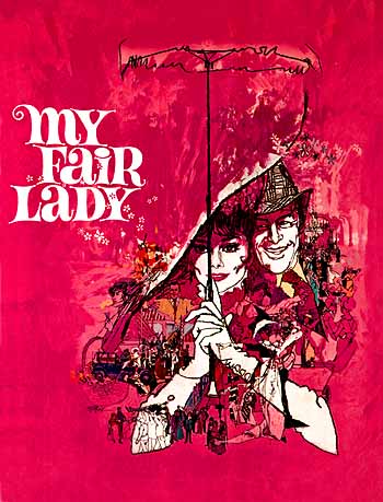
Another beach scene, but notable for the fact that Bob Peak did the art for this spread. Who's Bob Peak, you may ask? Fellow vintage-o-philes might remember his artwork for the program/book of the movie version of My Fair Lady, and a number of movie posters, with titles ranging from Every Which Way But Loose to Star Trek V. He's one of those staggeringly prolific and talented commercial artists from the time period. You can see more of his work here and here.

This one isn't signed Peak, but doesn't it look similar? All that lush color and dark pen lines. I love that the woman is holding her program so you can tell exactly what's going on (unlike the mysterious orchid scenario above)...she's at a Benefit Fashion Show! Is it wrong that I like the woman's dress more than the ones parading down the catwalk?

Anyway, what do you think about these Sociables? Have you seen any mid century illustrations or adwork that really knocked your socks off lately? Let's talk!
That's all for Wednesday (folks, we're halfway through the week!). Have a fantastic "hump" day and I'll see you on the downhill slide to the weekend! Til then.
How funny that you posted this! I just came across a couple of these ads in some Life Magazines a few days ago and thought, "Now THAT would be a cool blog post!", but hadn't done it as I've not been to mom and dad's and only they have a scanner! I love these too. The colours, the pen strokes. Well their just beautiful. They really do capture the essence (certainly idealized!) of that time period. The prosperity, the optimism, the damn fine fashion sense...it's all there. I agree that something was lost by the mid-late '60s in terms of advertising. It's interesting to look at the different years of mags and their adverts and how they changed. The first of every month, I change out vintage magazines (all 1950's and '60s) scattered round my house to fit the month we're in and it makes the differences sooo painfully obvious. The stories are the most interesting part of the late '60s mags, while I could stare for days at just one late '50s-early '60s ad.
ReplyDeleteThey're SO. COLORFUL. And attention-getting. And lush! I would like to have a painting of any of these, or even a large size print!
Delete50s wedding sponsored by Pepsi? Sign me up! Also, did bob peak do any early Barbie illustration. That's what it reminds me of! I love it
ReplyDeleteI'm not sure! That style is definitely similar though. I need to call Pepsi about a sponsorship before it's too late!
Deletejust love it! thank you :-)
ReplyDeleteThanks! I had to share!!
DeleteI feel like I need to drink Pepsi. I want friends and pools and orchids!
ReplyDeleteI KNOW, ME TOO! If drinkin' Pepsi buys me into that club, I need to start drinking Pepsi!
DeleteNo artist ID for the other, non-Peak, illos?
ReplyDelete