


I was looking for...I'm not exactly sure what...something else on Google image search when I came across these vintage Disneyland posters from the late fifties' and early sixties'. At first glance, the posters look like remakes in the style of mid century illustration...that retro-futurist kind of stuff you saw with the press materials for Down With Love . I thought about PIXAR, and the guys that do Venture Brothers, and just assumed these were some neat, throwback items.
BUT! These are NOT new-made-to-look-old! While most of the images I've brought over from Google Image are reproductions, they are reproductions of actual 1955-1971 Disneyland advertising. Which brings up the interesting idea that some things that are authentic-to-period don't look authentic-to-period because the market is so rife with close imitations that the original....looks....fake?


Case in point, I was at Goodwill the other day thumbing through men's short sleeve button up shirts for something a cute man would like to wear (you know who you are, Babu), and came across a blue, tiki-lounge kind of shirt about which I was immediately on the fence. It wasn't stupendous to begin with, but I was having one of those dry-spell days at Goodwill, where you carry this one plate shaped like the state of Florida or a t-shirt you're not really in love with but you can't go shopping for forty five minutes and buy NOTHING, come onnn....I looked it over once, then twice, then squinted, deep in thought as to whether or not it was more lounge or more louche. I had to check the tag to see if it really WAS from the 1960's (I'm not a snob about things being "for real vintage", but sometimes if it's from 1999, it'll take three washes before becoming a shadow of its former, color-vibrant self, and the buttons will fall off every five minutes). The faded, battered piece of cotton provided a provenance that probably was mid-century department store rack. And yet! I could not buy it.
I was stuck on the idea that it looked like a bad K-mart knockoff... poorly aped 60's style, when in fact, it was the real deal. The UBIQUITY of those poorly made, something-tacky-always-added psuedo lounge shirts actually kept me from buying a real one. As much as I love clothes, and will wear clothes that are outside the safety zone of t-shirts and jeans, I am no Isabella Blow. You have to care a little about what other people think of what you wear (unless you are, in fact, Isabella Blow, in which case, go'onwitchabadself).I know good and well from my own experience that people (both the ones you want to and the ones you don't want to) will look at your clothes and make an immediate judgement call as to what you're "about". While I do, habitually, dress Matthew up in a fashion that might err too much on the side of Kramer, I still have, in my heart of hearts, 60's man-about-town in mind for him. And if not that, at least rock n roller par excellence. Thus, having him go out in a black pair of pants and that shirt...with its discount-brand ambiguity...was not what I wanted. Again, this is coming from someone who never spends more than ten dollars on any piece of clothing, and believes in bargains-a-palooza, but gauche + lack of quality = you done lost y'mind, put that back in your closet.
I wonder, with mid century madness at a fever pitch as Mad Men trudges through its fourth (and excellent) season on air, how long it will be until some of the things I love become alien in my affection. Is it enough to love it like it is? The same phenomenon happens with music-- how you can't put "Start Me Up" on a mix cd without people thinking about car commercials, or "It's Getting Better" and Philips spots... will there come a breaking point? Or do some things remain classic regardless of paltry imitations and over exposure?
With that said, you can enjoy (unmitigatedly or not) these Disneyland posters, as the genuine article. Maybe a little too mordant for an article mainly illustrated by just the loveliest, whimsical travel-ish posters, but it got me thinking.
And as penance for the wanton way in which I ripped off these websites for a lot of the images, please direct your attention to the very bottom of this post for more websites that know a LOT more about these pictures than me. Me, I just enjoy them...authentico or no. :)


.jpg)


- Better scans of some of these on Flickr
- Vintage Disneyland ephermera of every shape and size here
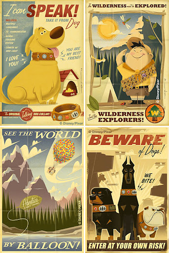
- Links to Eric Tan, who did a great job of using these images as inspiration for some of the print materials surrounding the PIXAR release Up, here and here
- Disney posters/history here
- And, as a special bonus, the "secret" and exclusive Disneyland "Club 33"
Actually, a few of these posters actually are "new-made-to-look-old"! Specifically, the Space Mountain and Tomorrowland posters were made by me a couple of years ago. (You can see more of my work at http://gregmaleticwork.wordpress.com).
ReplyDeleteI also did the Tarzan's Treehouse poster, but to be fair, it highly leverages the original poster in the '60s, so it's not entirely wrong to call it "vintage".
I had the darnedest time trying to tell the difference between pieces like your work and the originals! A testament to your skill as a designer, no doubt. They're very much "in the spirit of". Thanks for chiming in, I'll have to go back and give credit where credit is due!
ReplyDelete